DESIGN SYSTEM
/DESIGN-SYSTEM
One system. Every new page.
Open the agent chat, type /design-system and describe the page you need. The agent builds it from the styles, components and section grammar on this page.
GRAY. BLACK. MONO LABELS IN THE CORNERS.
ONE BIG THING IN THE MIDDLE OF EVERY SCREEN.
01 TYPE
Heading / H1
The wordmark and page titles. 50 / 1.1, uppercase, h1.
Agentura
Heading / H2
Section titles. 40 / 1.1, uppercase, h2.
Selected works
Heading / H3
Service and project titles. 30 / 1.1, h3.
Brand strategy
Heading / H4
Titles inside cards. 24 / 1.1.
Creative direction
Heading / H5
Names and small titles. 20 / 1.1.
Art direction
Heading / H6
Meta titles, dates, client names. 14 / 1.1.
Campaign 2026
Label / Mono
Corner texts, navigation, labels, buttons. Geist Mono 14, uppercase.
WE DON’T MAKE ADS. WE MAKE CULTURE.
Body / M
Running text and leads. Geist Mono 14, light, sentence case.
A creative agency that builds brands people remember, not ads people skip.
02 COLOUR
Neutral / Gray
#DBDBDB
Page background, the default section.
Neutral / Light
#EBEBEB
Corner texts and the wordmark on gray.
Neutral / White
#FFFFFF
Cards, images frames, text on black.
Neutral / Black
#1F2121
Text on gray, dark sections, footer.
Text / Muted
#737B7D
Secondary text and notes.
Border / Subtle
Black 20%
Dividers and card outlines.
03 PHOTOS
01
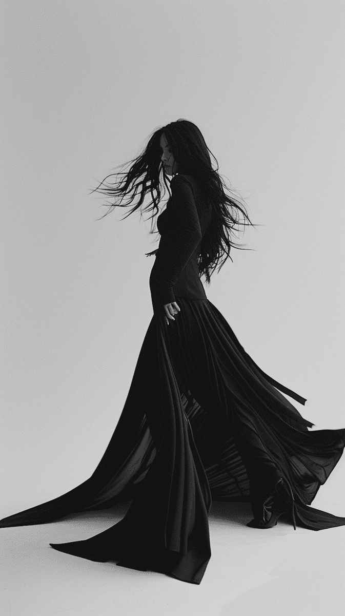
Monochrome or near-monochrome photographs of people, fashion and motion. No colour casts, no lifestyle stock, no screenshots.
02
Photos sit in the centre of a section, full height, or inside Card / Project Image. Corner texts stay on the gray margin, never over the photo.
03
Effects / Background Shapes and Background Transition go behind a photo, never over a face.
04
Every photo layer has alt text that says who or what is in the picture and the mood of the shot.
05
New pages reuse the photographs in the project or files the user supplies. Ask instead of sourcing.
04 COMPONENTS
Button / Primary
The call to action. Primary with arrow, Secondary outline, Primary No Arrow. Hover inverts the fill; the size never changes.
Button / Submit
Form submit only. The form switches Default, Loading, Success and Error itself.
Navigation / Nav Link, Navigation / Logo, Button / Icon Link, Button / Icon
The pieces of Navigation / Nav and the footer in the Template layout. Icon Link has a Black variant for dark blocks.
Card / Project Image
Project covers bound to the Projects collection: Horizontal, Vertical and Rectangle, each with a Phone variant. Hover shows the title.
Card / Blog, Card / Client Logo, Card / Testimonial
Blog cards bound to the Blog collection; client logos in the ticker; testimonial cards On and Off inside Section / Testimonials.

Card / Service, Card / Value, Card / Team
Full-width rows: a service with its number and description, a value on About, a team member. Desktop and Phone variants.
Marysia
CEO
Description
Section / Testimonials
The quotes block on Home: three testimonials switched by click, a Phone variant. Reuse it, do not rebuild it.


Effects / Background Shapes, Effects / Background Transition, Navigation / Template Badges
Shapes sit behind a section’s content (Vertical Hero, Center, Left, Right, Center Phone). Background Transition is the hero reveal on Home. The badges come from the Template layout.
05 SECTION GRAMMAR
Full-screen section
Every section is a frame with padding 40, usually 100vh, on Neutral / Gray or Neutral / Black. Sections stack in Main with a 5 px gap, inside an Inner wrapper.
Corner texts
A Top texts row and a Bottom text row hold two Label / Mono texts, max width 150, space between. They carry the manifesto lines, one thought per corner.
One thing in the middle
The centre of a section holds one big element: the wordmark in Heading / H1, a photo, a card row or a service row. Never a grid of small cards.
Spacing
5, 10, 20, 25, 40, 120. Section padding 40 (20 on phone), gaps between blocks 40 or 120, corner gap 5. Content max width 1520 or 1600.
Backgrounds
Effects / Background Shapes and Background Transition are pinned inside the section behind the content. Content frames get zIndex 1.
Black blocks
Testimonials, blog and the footer sit on Neutral / Black with Neutral / White text. One black block per page is enough; everything else stays gray.
READY TO MAKE SOMETHING WORTH KEEPING?
ONE CONVERSATION CAN CHANGE EVERYTHING.
IF YOU KNOW, YOU KNOW. REACH OUT.